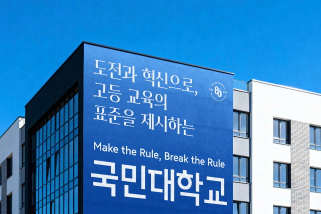
SEOUL, June 24 (AJP) - Digital typography acts as the unspoken visual voice of an institution, meaning the subtle shape of a written letter projects an organization's deeper philosophy to anyone reading it. To ensure its eighty-year heritage serves as a living tool for everyday human communication rather than a static monument, a Seoul institution has translated its core identity into two custom digital fonts to be shared with the world, Kookmin University said Wednesday.
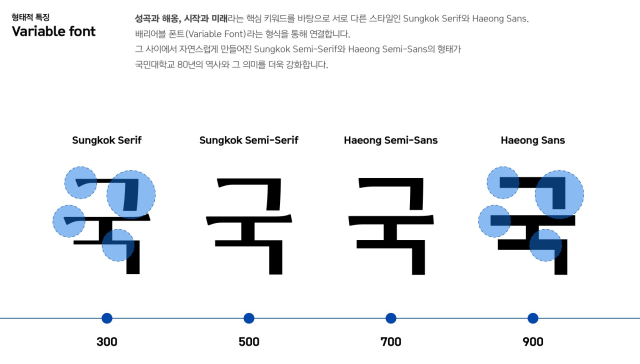
Conventional corporate fonts force everyday users to choose between two rigid categories: traditional styles with decorative little footings known as serifs, or modern, blocky styles without them. The newly developed typefaces bypass this standard limitation by utilizing a variable font system, allowing a single digital file to transform fluidly between a classic brush-like look and a sharp contemporary layout without requiring users to install dozens of separate style packages.
Kookmin University (KMU)'s announcement on June 24 marks the formal public rollout of the visual identity projects tied to the school's upcoming eightieth anniversary. The project, which required roughly one year of research and design, resulted in two distinct font families named "Sungkok" and "Haeong." Each family is engineered to carry a specific half of the institution's historical narrative.
Sungkok derives its name from the pen name of Kim Sung-gon, the historic figure who led the university's mid-twentieth-century revival, with letterforms designed to convey traditional institutional roots, sincerity, and a fundamental trust in people. Conversely, Haeong takes its name from Kim Suk-won, Kim Sung-gon's eldest son and the former chairman of SsangYong Group, utilizing a sleek modern aesthetic to represent a spirit of global challenge and technological innovation.
Rather than keeping the typefaces as an exclusive institutional asset, KMU released both under a Creative Commons license that permits free public use, provided the original designs remain unmodified. On campus, the fonts will provide a unified look across official anniversary banners, websites, and promotional videos. Outside the gates, the school views the open distribution as a public service, allowing everyday digital writers to utilize the professional-grade typefaces for their own daily work.
The human philosophy driving the software was articulated by the academic who led its creation. "This font development was not simply the work of making a new typeface, but a process of organizing the eighty-year history KMU has walked, and the future direction it will move toward, into a single visual language," Professor Park Yoon-jung at the Department of Convergence Design at KMU's Graduate School of Techno Design said.
"To naturally capture the meanings held by Sungkok and Haeong within the structure and impression of the typeface from the perspective of the university's spirit and history, we reviewed materials for a long time and refined the draft designs many times," the professor said, adding: "We will continue to develop typefaces that contain the university's history and tradition into cultural assets with public value."
The typographic launch anchors a broader institutional strategy titled "KMU VISION 2035: EDGE," an initiative designed to secure a competitive advantage in the higher education sector. The strategy's title operates as an acronym for four stated development pillars -- entrepreneurship, digital transformation, global competence, and environmental, social, and governance standards.
The university's leadership emphasized that the typefaces serve as a bridge between the school's heritage and its upcoming decade. "Font development is one of the ten major projects for the eightieth anniversary that looks back on the time KMU has walked and freshly presents the direction to move forward," KMU President Jeong Seung-ryul said. "The development of these unique typefaces will deliver KMU's own identity and vision in a differentiated way and contribute to raising the sense of belonging and pride among our members."
Both the Sungkok and Haeong typeface packages are available for free download on the official KMU website. The single-file downloads are formatted to work immediately without requiring the installation of supplementary style packs.
Copyright ⓒ Aju Press All rights reserved.
![[AJP Spiritual Asia ①] Why humanity must rediscover Asias spiritual heritage in age of AI](https://image.ajunews.com/content/image/2026/05/19/20260519085412753175_278_163.png)